Monday 30 December 2013

Mark Power 26 Different Endings

As part of my recent feedback for Assignment 4 I was encouraged to look at the work of Mark Power, Martin Parr, the great Henri Cartier-Bresson and Robert Frank The Americans.

I have already written blog entries for the last three artists and really admire their work. Some of these entries are in older blogs.

I therefore have concentrated on the work of Mark Power [b. 1959] an artist I have yet to explore. As a documentary photographer, Power's 26 Different Endings is an interesting concept covering the edge of the London A-Z atlas. Powers points out that the map changes in each edition with London growing stealthily each year. 26 Endings is a collection of 26 images taken just outside of the atlas starting in 2003.

The concept that these places may or will eventually become part of the atlas gives meaning to the images, without these the images have little value and are hard to relate to.

Most of the images depict a sad and run down to-be London, a mix of suburbia, sweeping paths, industry and mangled metal. perhaps the hope is that they will change over time as many areas in London have done through natural development.

In the context the of the work the images work very well, but I am not a fan of them if truth were to be known. What I am impressed with is that Powers has captured all of these 26 images from different locations yet you could be mistaken is thinking that they are all from the same area. This supposes that the world outside of the A-Z  has a common theme and possibly similarities of culture and people.

The following display these attributes.


The projects that Mark Power has completed are quite remarkable. His current project KX, documenting the refurbishment of Kings Cross Station, London, looks fascinating. For my final assignment I am planning to take images of a Victorian Brewery. I really like the colours and the use of light in the following two KX images and these may give ideas for my final assignment.
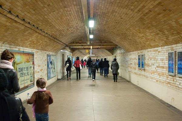


Saturday 21 December 2013

If Only for a Second

The world of social media comes yet again to a  blog post, this one I couldn't have let pass......

Social media sites and  news groups this month have had a proliferation of posts over a project commissioned by the Mimi Foundation in collaboration with Leo Burnett and photographer Vincent Dixon.

The aim of the project was to give 20 cancer patients an extreme makeover, to take them away from the daily reminders of their disease, and produce a wonderful story and set of memories for both the patients and their friends and family.

During the makeover their eyes were kept firmly shut so that they could not see how they were being transformed. Once complete they were sat in front of a one-way mirror. Behind the mirror Vincent Dixon sat with a camera recording the moments when the patients saw for this first time their new look.

Accompanied by a short video these images reveal something endearing, something wonderful and something positive; they really do capture this brief moment in time of jubilation when their worries are eased for Just Once Moment in Time.....

These images were released to the patients, friends and families on the 7th November 2013 at a private exhibition. The 20 images collected have also been published in a book with all proceeds going to the Mimi Foundation for Well-Being Centres for Cancer Patients. The book is available online and can be ordered here

From a photographic perspective the concept is not that unique in placing people in certain circumstances to obtain an expression or reaction. For example Olena Slyesarenko photographed here subjects under water with amazing results from a project entitled 'Pickled'in 2008. The aim was to restrict the expressions the subjects could make but surprisingly they still managed to express themselves. Images can be seen here

Likewise Jamie Sinclair's project 'Constricted Reality' captured images of people hanging upside down whilst holding their breath, again to trying to remove as much control as possible. Images can be seen here

Whilst these examples are aimed at restricting emotion Dixon's images are a release of emotion that literally floods out, and given the background of each individual, enables the viewer to share in this brief moment of time the jubilation and warmth of character. There are truly beautiful images that capture so much more........

Here are a couple of examples.... the video can also be seen here


Wednesday 13 November 2013

Juvenile Injustice

Richard Ross, a photography professor at the University of California Santa Barbara (UCSB), embarked on a very ambitious project to capture images and narratives of Juveniles throughout the USA held in detention centres. The main goal of the project is to bring awareness of the number of children held in detention centres and their conditions. Ross is quoted in stating that the work is to bring a reaction to as many people as possible so that the plight of Americas Juveniles held for their crimes may inspire some hope for reform.

Ross visited more than 200 detention centres in 31 states.This has culminated is a large network of sharing of images and stories on the blog http://www.juvenile-in-justice.com and a publication of 150 photographs in a book called Juvenile In Injustice as well as other forms of social media. The work has also been published in various forms of media including Harper's Magazine for which it was awarded the 2012 ASME award for Best News and Documentary Photography

In Ross' words: “I’m taking it out of the domain that I’m normally used to, and I’m creating a different audience that instead of looking at it and saying ‘Nice’ or ‘Interesting,’ they look at it and say, ‘This is wrong. How can I change it?’”

This is inspiring work in that to collects images to drive a reaction for change and from what I have read online appears to be very successful gathering a network of people across America lobbing for legal reform.

The children photographed are intentionally anonymous, often taken in isolation giving the feeling of loneliness, helplessness and perhaps abandonment. To this aim the images are nothing but a success in achieving their goal. It is wonderful to see art used to document our ever changing world but even more wonderful to know that it is helping to change it; this is what makes the images more powerful - the wind of change.

Ross' online website showing all of his published work is the best source for these images: http://richardross.net/juvenile-in-justice and make for a brilliant reference for this OCA course, showing how photography can describe the Places used by People. For me this work has been the greatest inspiration and has helped me to understand the relevance of this course within photography.

There are two many brilliant examples to show on this blog but here are my favourite five. I chose these for no other reason than they created the greatest reaction in me, which is Ross' aim.


The above image of a young teenager reading the previous occupants' graffiti suggest that this is a new arrival, a life changing moment. The despair of the room making this image evermore poignant.

The image below showing the discipline maintained in a correctional facility. All of the inmates have their heads bowed, perhaps in shame or submission. The colours in both of these images make for a striking balance.


The remaining images are very clever as are all of them in this collection..... one I will revisit.


Wednesday 23 October 2013

Exercise: Busy Traffic

This exercise explores space where people are busy. Typically shopping centres, public buildings, commuting or travelling terminals amongst many. For this exercise we are to try to capture the essence of movement and how the space is used. I chose to try an use some form of motion blur to indicate the motion and busyness. This was a challenging exercise in that not all places are open to photographs being taken.

The first set was taken in an underpass, although people where in constant shot they were not that crammed in as can be seen in the first example with most of the figures too far away.


The second shot taken only moments afterwards works a lot better. In it there are people in the far background, the middle ground and the foreground with some nice motion blur. This was by far the best shot of the small series I took, which I feel works well.


The second set of images for this exercise was taken in a small shopping centre. These didn't work as well as the underpass but do show the milling around of people. The best image is probably the third, this image shows more motion and has varying sized people making it more interesting. They also all seem to be flowing in the same direction which gives more of a flow and less randomness.


Tuesday 22 October 2013

Exercise: Making Figures anonymous

In this exercise we are tasked with producing 2 to 4 images that include people in a particular place but having them unrecognisable. This could either be small and many, facing away, in silhouette, partly obscured or motion blurred.

I chose the options of small and many though I really liked the idea of a small silhouette I couldn't quite find one for this exercise but will make a note of this perhaps for the assignment at the end of this section.

The first image was taken in a public garden. I decided to process this one in sepia, not really sure why but the colours were bland so I tried monochrome, but that lacked warmth so I went with sepia and liked the results. I like the framing of this one with the tree to the right and the light in the middle. The man feeding the geese is unrecognisable and at first not really noticeable as he is almost camouflaged into the image, in fact this may have made a better image than the 'Single Small Figure exercise.'


The next image is of iconic London on a warm late summer's afternoon. Having the small unnoticeable many figures gives this image a great deal of scale with the London Eye in the background over Horse Guards Parade. Using unrecognisable figures in images is a new concept to me and one that I think is extremely useful. I have sometimes captured strangers in the distant that 'make' an image but rarely considered adding them to places I have photographed...... I will have to remember these exercises.


Saturday 19 October 2013

The Sharing World of the Internet

The Internet is a wonderful place for sharing through social media sites, emails, blogs and personal web sites, making the proliferation and dissemination of information so easy. Although I receive quite a lot of photographic information from these sources most often they are images of cute furry animals or landscapes of New England during the fall or staggering images of Antarctica. As such it is rare to come across images that are thought provoking, but a set came through on email entitled 'Great Historical Photographs' from my mother and most of them are absolutely fascinating.

My favourite and one that still provokes thought comes from the website http://beforethechador.com/ This is a website dedicated to images of the pre Iranian Islamic Revolution. It it it mentions that the if it were not for the dramatic changes of 1979 the Caspian Sea could have been a holiday hotspot akin to the French Riviera, and that Tehran as a financial capital aligned with London, something I had never considered as an adult.

Growing up around this time my neighbour was Iranian, they were wealthy affluent and free so I can at some point relate to these images. Now Iranians are told how to dress by their government with serious consequences if not adhered to, this is especially true of women who are treated as second rate citizens with little or no voice or identity. To a westerner it is as if the country has been thrown back 50 years, denied the progress that it deserved and deprived so many of freedom.

The following image from 1963 conjures up a variety of thoughts - the location of a beautiful beach on the Caspian Sea, probable not used for leisure much today. A western car and the focal point of a beautiful young woman draped over it in a relaxed and contented fashion. Her bathing suit, at the height of fashion in the early 60's, off the shoulder would certainly have caused a storm in Tehran today. But this image also describes the wealth, freedom, openness and beauty of this era all of which have been denied for the past 34 years. It makes me wonder if scenes like these will return? I certainly hope so in my life time

  cid:12.435290197@web121605.mail.ne1.yahoo.com

Although I may have painted a sad picture of Iran today, I do not believe it is all bad. The people are what makes a nation and the Iranians will not have changed in one or two generations. The following web site 'A View inside Iran" [http://www.theatlantic.com/infocus/2012/01/a-view-inside-iran/100219/] balances this article showing modern day images of Tehran, though screened by the government, they do depict a more open society than we are perhaps led to believe.... this still shows a beautiful country and fascinating people of diverse cultures from Islamic to Christians to Jews.....


Friday 18 October 2013

Exercise: A single small figure

Starting this module of the course moves us more into people and how they fill space. It is obvious that when a person fills space within an image it gives us more relevance and able to relate to a place, even if we have not been there.

In this exercise we are asked to produce an image with a person in it at distance so that the scale of the image can be realised. Although the notes associated with this section suggest that the figure can be a surprise fore the viewer in having a delayed discovery time for the viewer, it should be fairly obvious. For my choice I took this image in autumn over the Ashdown Forest and although the figures are not a surprise I feel that this captures the essence of single small figure. I was lucky in capturing this one with the autumnal colours and the tree line acting as a doorway.

This is something I have never considered to give scale to an image, without this figure the image would certainly not appear to have as much space as it does as shown below and certainly lacks interest.


Tuesday 15 October 2013

Photographing Together, On the Road, Down Under

Whilst searching through online blogs suggested by this modules tutor I came across a very pertinent blog on flakphoto.com

Amy Stein and Stacy Mehrfar are two American photographers who have travelled across Australia taking pictures of people and places on their journey; there work is unusually entitled Tall Poppy Syndrome. I had to Google this to find out what if anything it meant and the definition from Wikipedia was....

To describe a social phenomenon in which people of genuine merit are resented, attacked, cut down, or criticised because their talents or achievements elevate them above or distinguish them from their peers.

Being American's this naturally goes against the grain of their culture and when they discovered this term they investigated it with photographs a challenging and interesting concept, in their words......


This work is published by Decode Books (ISBN 978-0-9833942-2-8) and was exhibited in New York earlier this year at ClampArt.

The number of images shown is limited to twenty one, and these a a mixture of various sources. However a few more are available online to view via decode books [ http://www.youblisher.com/p/390554-DECODE-BOOKS-Tall-Poppy-Syndrome-by-Amy-Stein-and-Stacy-Arezou-Mehrfar/]

This work is interesting from this courses perspective as it helps in some form of guidance as to others views of capturing people and place. The images do capture an air of place and the people that use them, also the variation of how people are photographed makes for a more interesting set of images. Some are in portrait, others distant and unrecognisable.

This is a great collection of images though if I am to be honest from the limited selection I have seen I cannot relate these images to the Tall Poppy Syndrome, I am also unsure of how this could indeed be captured. There are though a couple of images that could suggest this....


In the above image it would appear to be taken of two girls at school. Their clothes suggest they are equal but their poses are very different perhaps one being uncomfortable in the others presence. This image has echo's of the Diane Arbus twins image.

The other below looks like it was taken at a WI meeting. The lady in the middle is the only one with eyes on the camera, whilst the others busy around. To me this suggests that the person in the middle, perhaps the chair, is the one that has the talent for leading and running this group but may be an outsider resented inwardly.


The above image is very clever and could almost mean anything to anyone. I do think that the images capture a sense of people and place and is one I struggle to visualise in planning. Hopefully this work will help in being able to see images of note.

Monday 30 September 2013

Assignment 3 Tutor Feedback

I was generally pleased with the comments received on this assignment. Overall the composition was well received with the exception of the childrens' library. I agree that this shot has too much 'table' in it and a better shot with the camera on the table showing a child-eye view would have been better.

The remaining comments were regarding processing of the images and the printing of these. I have to admit that I have yet to find a wining combination of printer, paper and ink as well as the settings whilst printing. Having bought a new printer ahead of this assignment and have only just started to experiment, I thought the images were of a good print quality but obviously can be improved.

A lot of comments concentrated on the following image with reference to only one other image, I found this a little disappointing. My two favourites were of the pub with no comments received.


This was a hard shot to take due to the lighting conditions, reference was given to noise which I can see at 100%, this must have been introduced in the HDR process, one I need to watch out for in the future. The feedback also suggested  that their was a colour cast around the windows, this confused me a little as I cannot see one, whereas the adjusted version below has a magenta cast. However the levels on this are much brighter giving a clearer image and I can now see where the electronic version fails. Again I am struggling with getting the correct print and paper as the printed version looks fine as was commented on in the feedback. One I will try harder on for the next assignment.


Saturday 7 September 2013

Photography - A critical Introduction

I have just started to read Photography: A critical Introduction edited by Liz Wells. Unlike most books on photography initially this book did not have many example images and is quite hard going. Nonetheless it is full of interesting material which I will probably come back to.

Flicking through the pages of some of the images I was drawn  to Andres Serrano (b.1950), The Morgue (Fatal Meningitis ) 1992. From the title the viewer is immediately saddened to know that the image is that of a child that has died. Serrano visited many morgues and photographed a collection of people, some of whom had a violent death. This is akin to Victorian days where dead people were photographed as keep sakes, this was also very popular for children but soon died out by the turn of the 20th century.

Going back to this image though is, as the book describes,  'blurring the line between sleep and death'. The child looks asleep, at peace in an air of serenity, leaving the viewer with many mixed emotions. Yet the child leaves behind parents who will be distressed and this causes friction between the viewer and the photographer as someone who should perhaps not have taken this image and left the parents to grieve and the child to rest in peace.

I would hope that the parents gave their consent for this image to be taken and published. Perhaps to make others aware of the modern day plight of death in children through meningitis. Politically this image could be used by a Government or Health Organisation advertising awareness in the disease, trying to capture the imagination and feelings of parents, grandparents and careers. One would hope if it were then the death of this individual would have some meaning, something we all try to extract from life and death.

Serrano is an interesting artist, of mixed styles, some of them very controversial, a provocateur  perhaps! This is though a very beautiful image made from a tragic event.


ref: http://en.wikipedia.org/wiki/Post-mortem_photography

Context & Narrative

Just finished reading 'Context & Narrative by Maria Short. I must say that after I read the first two chapters I was really taken with this book and found it a quick read. I t has also given me some ideas for the assignment by looking at the work of Jurgen Perthold who strapped cameras to a cat's collar taking pictures of where they went every second at a fixed exposure reveals some interesting spaces. I am looking at our own cat flap and what it must be like for our cats to come in everyday.

At the end of each section Short gives a case story explaining the chapter in terms of real project experience from professional photographers. This is invaluable material in seeing how the pros prepare and view an assignment. In the first Richard Rowland, a photographer working in a housing association, heard of plans to refurbish a building used by homeless men. He drew up plans to record the building with its occupants and all stages of the refurbishments. In his words this was by ' recording the historical and cultural aspects of the layers of the property that had been hidden for many decades. Layers that didn't simple expose the structural elements , but also revealed something about the social  history present - the lives gone before and the cultural references left as markers on the very fabric of the building.'

His images are very contrasting....he certainly captures the starkness of the building beforehand and the loneliness of its occupants, with 55 visits to the building I am surprised I cannot find more of his images on-line, a shame I would have liked to have seen some of the later ones.

The Regency Project - Richard Rowland

The second chapter revealed a very interesting project by Charley Murrell - Constructed Childhoods. In this project she explores how images that surround us in advertising, television and other media can form opinions in young teenagers. These images are then translated into how the teenagers perceives and project themselves in society perhaps even adhering to the status quo. The images also reveal a sadness in this suggesting that what the media moguls display is not necessarily the road to happiness for many as the reality of their lives does not live up to the dream causing a lack of self confidence.


Constructed Childhoods.


Thursday 5 September 2013

Exercise: How space changes with light

This exercise explores how light can affect spaces in which we photograph. This could be how the shadow areas change, which may evening cause the photographer to change the viewpoint of the image. Or in bright light how high contrasting images give a much different feel to images created on an overcast day.

I chose to photograph my study at various times of the day and with various weather outside. Trying to vary the angle where appropriate.

The first image is taken on a bright sunny day with the light streaming through the windows using two angles, the second I think is a better image giving more feeling to space and light.


From the same angle and around the same time of day but taken on an overcast day.


This image is less warm and with the diffused light has less shadow areas and less contrast with the outside. This did not vary as much as I thought it would but is probably due to that fact that the room has a lot of light entering it all of the time.

The final image was taken at dusk with pretty much even light from inside and out leaving a flatter image with the outside exposed the same as the inside and the screens much more prominent as the main source of light.


Exercise: Exploring function

This exercise is about exploring space in the context of its function, that is what it is used for and evidence demonstrating use or activity.

For this exercise I went to the public section of local council offices. These are used by various parts of the community from exercise, entertainment, the library, and of course local information. I took several shots of this scene, trying to demonstrate the space, but then I considered that it is not necessarily the vastness of the space that is important as this has no bearing on its use.


The area in question is a public area for information outside of the office, obviously meant to answer the basic questions and amenities of the building and the surrounding town. To me the leaflets of information were key as were the chairs in which to sit to read the information, so I tried to capture all of this along with the high contrasting light that poured into this glass atrium.


This image works a lot better in the description of the area and focusses in on the information and furniture. Evidence of use is also left behind by a newspaper left on the tables. I am not sure if I have succeeded in this exercise or not perhaps if people were in it it may have a greater bearing.

Saturday 1 June 2013

Robert Frank & Maria Short [Context and Narrative]

Robert Frank's name has now come up in a couple of places. He was referenced in my last assignment report and also referenced in the book I have just finished, Context and Narrative, by Maria Short. In fact Short's book references Frank's work twice, firstly under symbols and then again under a section entitled text.

I was interested in both of these sections, more so on signs and symbols, or as it is correctly defined as semiotics. I had not considered, other than incidentally, the use of symbols and indeed their power in portraying images to the viewer in how they relate to them perhaps on a personal level.

Franks 'The Americans' was referenced in Short's book as a collection of photographs exploring symbolic meaning. Many of his images have symbols relating to wealth, standing, a moment in time, and class. Sarah Greenough, Curator of Photographs at Washington DC's Gallery of Art, describes this work as the single most important collection of photographs since World War 2.

I was drawn to the following image with two symbols and text. The obvious is the newspaper title, a day that shook American's all of whom could identify with Norma Jeane aka Marilyn Monroe, who started life as a poor child, spending most of her live in various foster homes, yet becoming one of the biggest names and sex symbols in the twentieth century. What makes this interesting though is the girl waving what looks like the American flag, and act normally enacted for celebrations. What America mourning or celebrating her life?


Franks images are a great inspiration for reportage. Short's book references his later images under the section of 'Text'. Sick of Goodby's is a quite disturbing image, unlike his other work, one wonders what is really going on. The writing, by Frank's hand, in a large mirror is supposedly meant to mean Sick of Goodbye's. The emotional pain may be a reflection of the loss of Frank's daughter, Andrea, and his difficult relationship with his son Pablo, who was committed for schizophrenia as well as the break up of his marriage. Perhaps on reflection we can associate the pain in all our lives to some extent with this image.


Finally, Short's book was a really good read that gave many ideas and references at a very high level. Something I must try to see in all images I take and look at.

Thursday 30 May 2013

Assignment 2 Feedback

Some really good feedback from my latest Assignment and will some good constructive criticism. I agree with the comments that I focussed too much on the play at hand and did subconsciously try to recreate the story line and not the event itself. Indeed having a more varied number of shots showing street backgrounds, microphones and speakers etc. would have worked well, as would having the Church in the background showing the location. I looked at the professional photographer's work from the day and although I wasn't that impressed with his work it did have this shot and did have variations in styles. I big lesson to be learnt here.


I liked the crop of the crowds, focussing in on the two young actresses. I did consider cropping this image at the time, but not this crop. I think that this works really well and makes a much better image.


In many of the images there were suggestions for corrections, mainly in terms of contrast and colour cast. The tutor was trying to demonstrate how to get the images as close as possible to a natural look. However I purposely processed the images to get the look and feel I wanted, using high  contrast to give mood, and boosting the warmth of certain images. Obviously this is down to personal preference but I found some of the comments more suited to the DPP course and would have appreciated more comments of the subject matter rather than the post processing.

With that said on reflection the comments made are quite correct and something I need to pay more attention to detail on. I will certainly change the cropping on the above image and re-print for final submission.

Some excellent references though in this report for other photographers. One I will write on in my next posting!


Wednesday 24 April 2013

Exercise: An organised Event

For this exercise I chose another local fete. Unforgettably I had to cut the trip short but I think I managed to capture a couple of reasonable images. The better ones were when people were preoccupied with some of the entertainment. Other images tended to be taken at some distance.

I am starting to feel more confident in capture images of people unaware but still have that bashfulness and air that I am invading peoples privacy.....I just need to keep taking and looking for more opportunities.